Showing posts with label Art Practice 1B Art and Text. Show all posts

Monday, 27 April 2015

Art and Text Evaluation

Through this theme of art and text, I developed my skills as an artist by learning a new technique, which I had not explored before, of screen printing. I enjoyed the entire process of creating the prints, from designing them on paper and editing them on Illustrator to printing using the screens. 

Nonetheless, I did face some challenges throughout this process, which I resolved and improved on when creating a second series of prints. The first challenges I faced were digitally when editing the design on Adobe Illustrator, which was also a skill I was new to, having not used the software before. I also had some issues with my first prints of human error as I misaligned the second layer, or did not push the paint across the screen hard enough resulting in an inconsistent print. After experience though, these issues were resolved and resulted in my second series of prints being completely consistent.

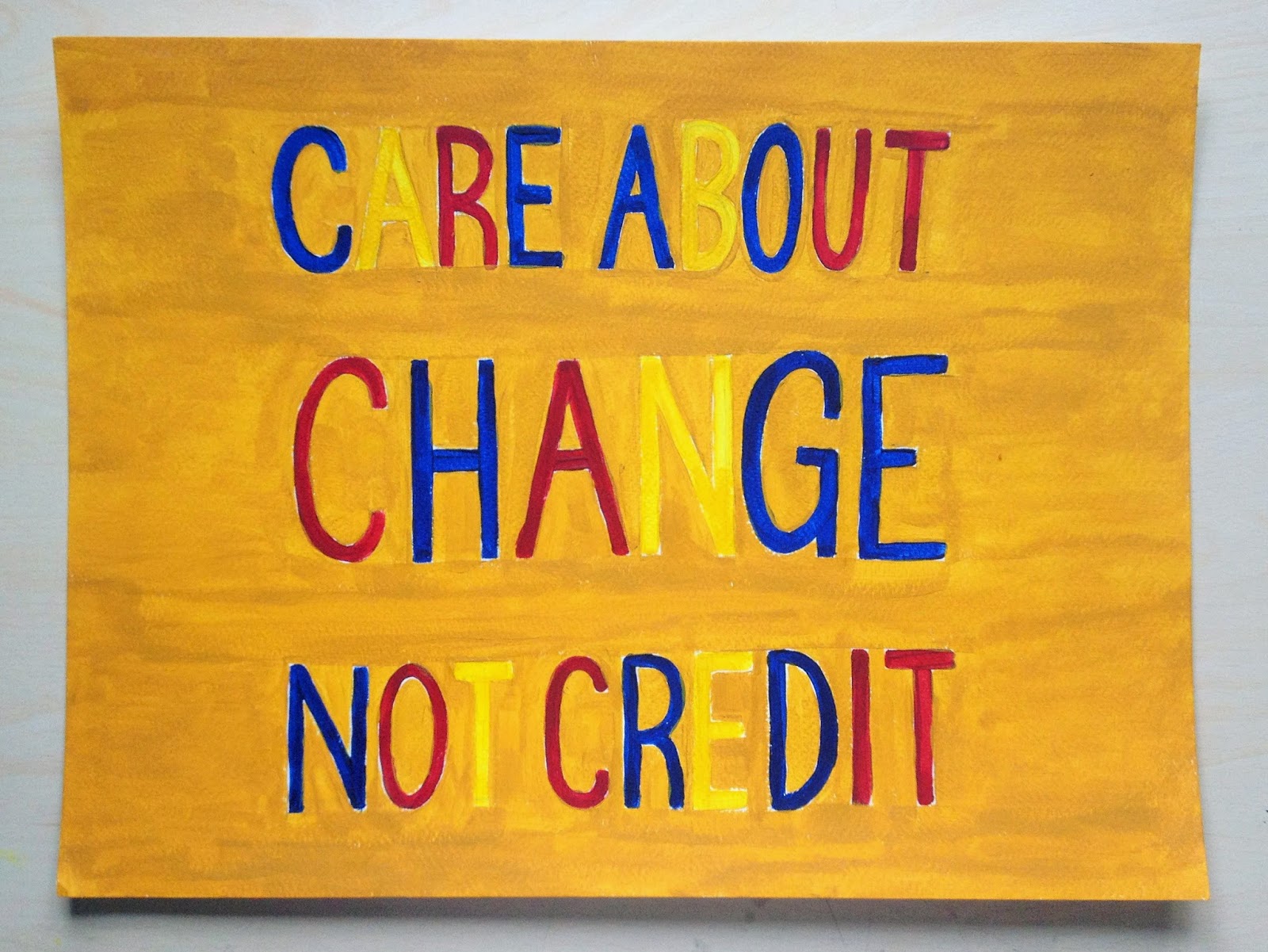
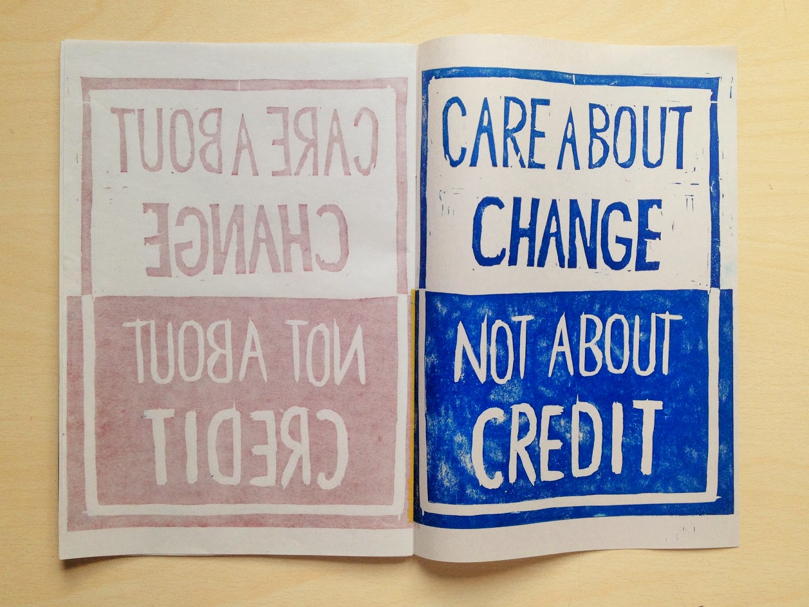
After creating a series of screen prints, I took another look at the theme of Art and Text through the focus of my Studio essay and my interest in the artist Bob and Roberta Smith. In response to this, I created a series of signs from the art manifesto I wrote last term, which summarized what I think is important about making art. From this, I selected key sentences and phrases to use as the text on signs made on paper and made into a book and on scrap pieces of wood. I enjoyed returning to this project from a different perspective and incorporated skills I learnt from the book binding workshop when turning the signs into a collection. 

Wednesday, 22 April 2015

Monday, 20 April 2015

Book Binding Workshop

Today was a session in the print making room on book binding. As I have already explored making books in my book binding elective I wanted to build on this experience and progress some ideas that developed from this. For example, the idea of creating a book from art, rather than filling a book with art was something discussed in this elective. Therefore, I decided to use this time to build on the new set of work I was exploring of signage, inspired by the chosen artist of my essay Bob and Roberta Smith, and create a series of lino prints of signs to the bind into a book. 

I created a lino print using the phrase from my artist manifest: 'Care about change not about credit'. I wanted to create a lino print to be able to create multiple prints of the message, to emphasize it's importance that it is a message that is worth repeating and a message that is important enough to fill an entire book. I printed on A4 newsprint, one print on each side, so that once folded to create a book there would be a print on each page. I explored the combination of the primary colours with these prints, and like how no one print is identical due to the irregularities that occur from hand printing with lino.


After printing on both sides of 12 A4 sheets of newsprint and allowing them to dry, I used my book binding knowledge to bind the books using a pamphlet stitch. However, unlike the pamphlet we learnt to make in book binding I decided not to create a cover, but simply leave the pages as the entity, to imply that the message inside is the most important part of the book. I found this process very interesting in connection to the first session of art and text where we explored destroying and defacing books, whereas here I was creating a book.


Developed Sign Art

After developing art and text on signs, I chose the best designs and worked on found wood using the same techniques as the artist Bob and Roberta Smith.

Thursday, 16 April 2015

Exploring Signage

I decided to start by exploring traditional methods of signage and, like the artist Bob and Roberta Smith, work on found materials and paint the lettering free hand. I found scraps of newsprint as the base for these experiments, and mixed shades of the primary colours blue, red and yellow for the lettering and background colour. These colours are often found in Smith's work, probably due to the nature of the colours being bold and standing out, reflecting the purpose of the sign. 


Monday, 13 April 2015

Art and Text Revisited Proposal

Following the focus of my Studio essay and my interest in the artist Bob and Roberta Smith, I have decided to return to the theme of Art and Text but with the influence of this artists work on my own practice. Bob and Roberta Smith is the alter ego of artist, writer, author and musician Patrick Brill, born 1963. This name comes from the combination of his sister’s name ‘Roberta’ with the common names ‘bob’ and ‘smith’ to create a purposefully ordinary male and female alter ego. Smith plays on the immediacy and power of words in his art, creating signs to communicate political issues.


Smith appropriates sign writing, adopting the materials and style of signage for his paintings, using found materials, such as wood bases, and lettering freehand with single layers of paint, drawing on the traditions of folk art and craft, rather than ‘high’ art. This gives his work a more authentic feel, as the imperfections help emphasize the representation of the ordinary, the masses.


For my own work in response to this, I will create a series of signs from the art manifesto I wrote last term, which summarizes what I think is important about making art and can be seen below. From this, I will select key sentences and phrases which will be used as the text on these signs. 

Wednesday, 25 March 2015

Final Prints

The brief for this project was to create a series of 11 identical prints incorporating the theme of text, below you can see two of the most successful prints from the two series of 11 prints I created. Through this theme of art and text, I developed my skills as an artist by learning a new technique, which I had not explored before, of screen printing. I did this by creating a series of prints in the workshop and even gained the confidence to return and work independently to create another complete series of identical prints. I enjoyed the entire process of creating the prints, from designing them on paper and editing them on Illustrator to printing using the screens. 

Nonetheless, I did face some challenges throughout this process, which I resolved and improved on when creating the second series of prints. The first challenges I faced were digitally when editing the design on Adobe Illustrator, which was also a skill I was new to, having not used the software before. I had difficulty separating the layers of colour and my biggest struggle was trying to create the text in the shape of a circle around the Mandala I had designed. To resolve this I watched online tutorials on Illustrator and began to understand the program more, so that I would know how to use it much more efficiently in future. I also had some issues with my first prints of human error as I misaligned the second layer, or did not push the paint across the screen hard enough resulting in an inconsistent print. After experience though these issues were resolved and resulted in my second series of prints being completely consistent. 


Tuesday, 24 March 2015

Independent Printing

Following the session in the printmaking workshop, I enjoyed the process and outcome of screen printing so much that I decided to book another session in the print room to work independently on my prints and create another series in a different colour. This time I mixed a pink colour to use as the base layer of my print. The pink has connotations of compassion, nurturing and love, which I felt reflected the text in a similar way to the calming nature of the turquoise. I also chose a colour that would compliment the turquoise when presented side by side, and to further tie the prints together I used the same shade of grey for the second layer and outline of the print. 


Monday, 23 March 2015

Screen Printing

The screen printing first required transferring the design onto a screen and then printing in a two step process of printing the first layer and colour of the print and then washing the screen and printing the second layer and colour. The first images below show the two separate designs I created on Adobe Illustrator and then printed on paper that were transferred onto a screen. 

When creating the prints, I was very conscious of the importance of colour in reflecting the text. I mixed a turquoise colour for the first layer of the print because of its connotations, with blue levels radiating peace, calm and tranquility and hints of green presenting balance and growth. The colour thus reflects the context of the Mandala design and the text which encompasses it. After printing the first layer, I tested the colour for the outline by smudging it with my finger next to the design, I chose a soft grey colour over black, so that the lines were not too harsh and yet again reflect the softness of the ideas in the text. In the images below you can see the layers separately, as well as the final design with the layers overlapped.


Friday, 20 March 2015

Screen Printing Design

My design is based on the work I created for the drawing elective, which was based around Mandala designs. I started by drawing the design on paper using black fine liner, which I then scanned onto the computer and edited using adobe illustrator. For the screen print we needed to have to layers to the design to be able to print in two colours, so I filled in sections of the drawing and created text in the shape of a circle to follow the outline of the mandala and saved these on a separate layer, so I was left with an outline f my design on one layer and a fill of colour on another, these would then be separately transferred onto the screen.

Choosing the text for this design was very important to the theme of the project. I decided on text that related to the mandala and found inspiration from researching what the meaning is behind a mandala. 

Wednesday, 18 March 2015

Screen Printing Introduction

Also in Monday's session, a small group of us had a meeting with Felicity in the print making workshop about screen printing. Screen printing is a printing technique that uses a woven mesh to support an ink-blocking stencil to receive a desired image. In this meeting we were shown how to create our own screen prints and explained how we could incorporate art and text when printing with this method.

Following this session, I revisited the workshop on Wednesday to was my screen and to discuss my design ideas with Felicity. 

Tuesday, 17 March 2015

Book Experiment

After yesterday's introduction to 'Art and Text', I visited Rob's workshop to further explore the work with altering books. I separated books into pages of about 100 and used a drill to make holes through the section of pages in the shape of letters. To decide what word to spell out I chose the first 4 letter word my eye was drawn to- 'NICE'.


nice
nʌɪs/
adjective
  1. 1.
    giving pleasure or satisfaction; pleasant or attractive.
    "we had a very nice time"


  2. 2.
    (especially of a difference) slight or subtle.
    "there is a nice distinction between self-sacrifice and martyrdom"

Notes on Powerpoint

Mark Titchner (1973)

  • Explores tensions between different belief systems- religious, scientific and political.
  • Creates sculptural installations without mockery or cynicism, so viewer can reach their own conclusions.
  • Uses the inclusive pronoun 'we' to include and challenge the viewer.
Martin Creed (1968)
  • Creates light installations using neon lighting and simple phrases.
  • Nominated for the Turner Prize.
  • Uses ambiguous phrases, such as 'everything is going to be alright', which is often used as reassurance when meaning the exact opposite.
John Latham (1921-2006)
  • Incorporates books as sculptural pieces, similar to the exercises we were doing at the start of the session.
  • His series of 'Skoob' work (books backwards), involved destroying books, including Greenberg's 'Art and Culture' with the idea of ingesting and regurgitating ideas.
Raymond Pettibon (1957)
  • Designed album covers.
  • Quotes text rather than creating his own text.
Mel Bochner (1940)
  • Uses bright colours and simple words and phrases like 'bla bla bla'
  • Political artist.
  • Part of group called 'Art and Language'.
Bruce Nauman (1941)
  • Interested in the activity of making the pieces rather than the final outcome, as such he moved on to video.
  • Creates playful neon lights.
  • Works with spoken text about communication and mis-communication.
Wendy Maruyama (1942)
  • Interested in political issues and history.
  • Created a piece recreating the identity tags of people in war camps- shows the importance of names.
Kurt Schwitters (1887-1948)
  • Incorporated recycled materials, such as newspapers and advertisement.
  • Part of dada.
  • Came to Britain as refugee of war.

Art and Text Powerpoint

In the afternoon of the 'Art and Text' theme, we were each given an artist to research and create some powerpoint slides of them to put together as a group and present. I was given the artist Bob and Roberta Smith, which is the alter ego of artist Patrick Brill, who creates political sign art. I included my references in the presentation (which can be seen below by scrolling down) as I would like to explore this artist further.

Art and Text Presentation

Monday, 16 March 2015

Art and Text

We started by introducing ourselves to the theme of 'Art and Text' in a very practical way, using old books as the basis for some experimental pieces.

We started by defacing the books- tearing them and crossing out words or even lines of text. This action seemed very unnatural at first, to deface an object that is meant to be read and changing its purpose, so that it no longer reads the same way.


We then found a single word from the book and tore that out- I was drawn to the word 'moist', because by taking it out of the context it was used in the book, which was in reference to baking, it has a variety of connotations, including sexual connotations. This action highlighted the significance of single words and how they can mean completely different things when taken out of context. 


We also chose a phrase in the book that had a personal link to our own manifesto in art, I chose the following phrase-